Behind the Illustrations of the Year’s Most Anticipated Cookbook
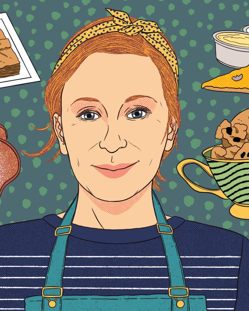
Salt Fat Acid Heat author Samin Nosrat and illustrator Wendy MacNaughton on bucking every modern cookbook trend for a definitive guide that looks like nothing else
We're in golden age of cookbook design. Which is not to say there is an abundance of useful cookbooks. Simply, that there are very good-looking cookbooks, many of which have a similar format: a cleanly laid-out recipe facing an artful image of salad or toast, all on uncoated paper. "Good-looking" often translates to "novel" or "coffee table," but rarely to "necessary" or "reference."
Salt Fat Acid Heat is a refreshing break from this contemporary formula. Instantly recognizable as a reference book, Samin Nosrat's definitive technique-driven tome defies convention. This is partly because Nosrat's method of teaching via the book's four main pillars (salt, fat, acid, and heat) is a rarity. Few cooks dare to break cooking into such elemental categories, and then deliver on their promise of demystifying the process. But what makes Nosrat's method so effective was her insistence that the book be illustrated.
Enter Wendy MacNaughton, illustration journalist, artist, author, and former social worker. A modern legend in the field of American illustration, MacNaughton translated Nosrat's vision into lush watercolors that toe a line between artful and practical, while remaining undeniably "MacNaughton." Which is to say, alive. MacNaughton's illustrations skitter across the page with delicate intensity, like fresh fuzzy roots meeting soil. Her hand-lettering often has the look of a tropical leaf on the verge of unfurling. And her adaptation of Nosrat's methods—from peeling beets to making mayonnaise—explodes into a dynamic universe of color.
Here, the two talk about how their collaboration came to be, how making Salt Fat Acid Heat worked, and all the inside art nerd jokes scattered throughout its pages.
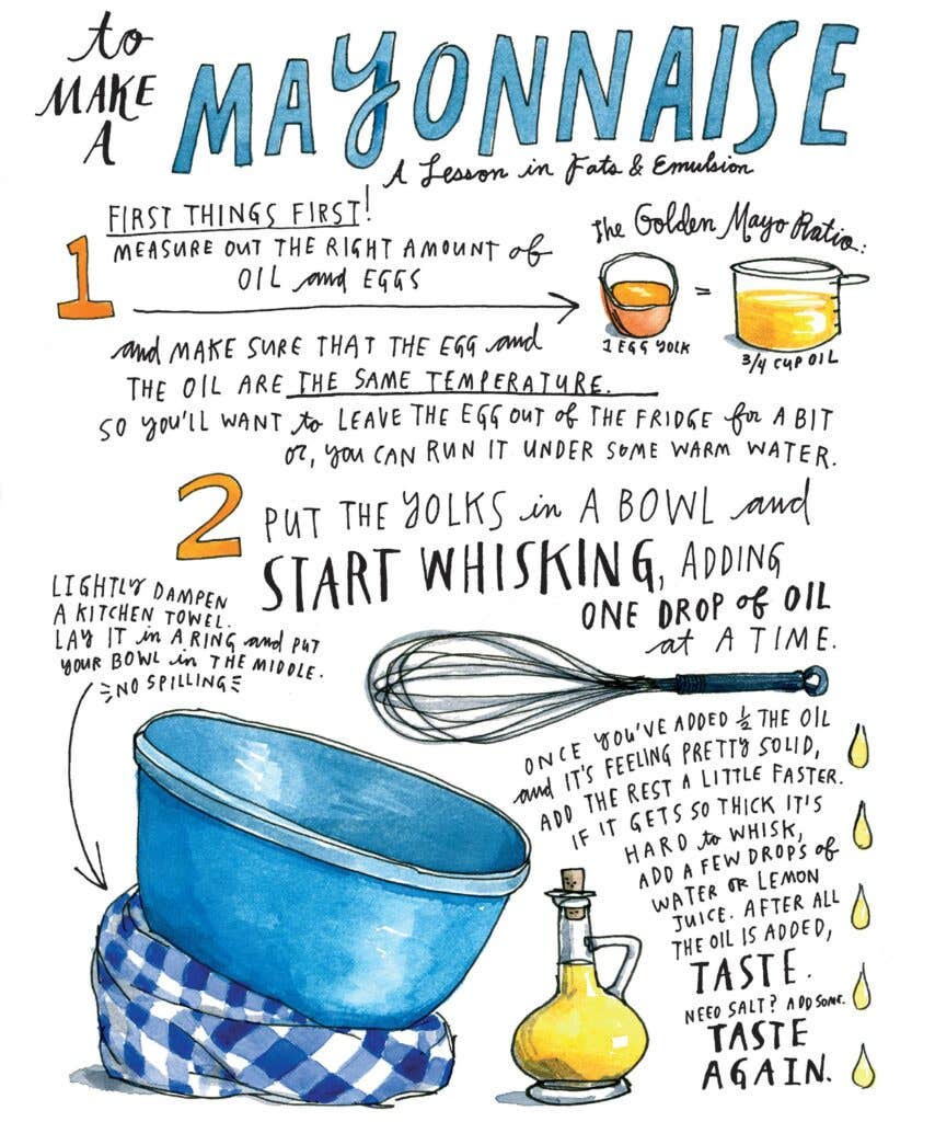
How did this collaboration come to be and how did you decide that this should be an illustrated book rather than a photographed book?
Samin Nosrat: I was working with Michael Pollan, teaching him to cook, and once he heard about my system he really encouraged me to pursue this book. That was 2009, 2010.
And what did you do?
SN: When he said that, I had this feeling in my gut. I knew from the beginning this book couldn't be photographed because it was about concepts, and about teaching people looseness in the kitchen. Photos are so precise and representational. I wanted to give you a way to use whatever you had on hand and not feel tied to a recipe.
It would have been disingenuous to use perfectly styled beautiful photos by my favorite photographers, and tell you, "You can do anything!" Michael advised me to turn my material into a curriculum and just teach it. So I taught classes over and over and over again. I noticed that some concepts were easier for me to convey visually and so I started making these very crude butcher paper drawings. I would copy science concepts out of Harold McGee.
Wendy MacNaughton: You were doing diagrams.
SN: Yeah. I was okay. In the meantime I was also like deeply stalking WendyMacnaughton.com.
WM: That's actually my full name.
SN: We didn't know each other but we had a lot of friends in common, which I knew because I deeply stalked her. I drew a Venn diagram of the people in our lives and things that overlapped.
WM: If I was wooing Samine, I would have like baked her cookies or something. I was making a lot of Venn diagrams at the time.
SN: We just found the email the other day and the subject line was, "You might think I'm stalking you." Or, "If you think I'm stalking you, you'd be right." I wrote to her and said, "You are the Maira Kalman of my generation. I want to make this book that's different than other cookbooks." I wooed her with all my powers.
WM: I responded, "There is no Maira Kalman but Maira Kalman, but if you want to make my heart melt, that is the right thing to say. And: "Yes I will, do your thing, yes!"
SN: We met up and I don't think I understood that you didn't know anything about cooking.
WM: I probably didn't make that quite clear.
Did you learn to cook by illustrating this?
WM: Yes. I had private lessons where I got to ask Samin to do things again and again so I could draw them and ask a ton of questions. I draw from life. I can draw from a photograph, but drawing from life gives a live quality that is very alive. Drawing from a photograph is very flat.
SN: We did a big braise the first time I went to Wendy's.
WM: She shows up with all this amazing produce and groceries all from the farmer's market. Colors I haven't really seen before in food. It was so beautiful. As she started cooking, I was over her shoulder with a sketchbook the whole time.
SN: And she doesn't have to look. I can cut vegetables without looking, and she can draw without looking.
How did you actually execute the relationship between the illustration and the technical instruction?
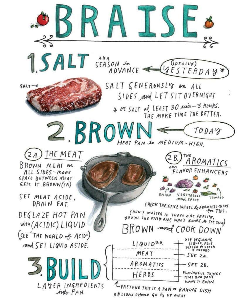
SN: To me, this [illustration of braising] is a good example. I was like, "Now you've seen me do it. Just turn it into one of those things that you do. She was like, "That's not how it's going to work."
WM: There are somethings that are beautiful to paint—like this slab of raw meat—and you come out with like a gorgeous, very realistic, lush drawing. There are other things that are not necessarily the most beautiful things to paint, like brown cooked meat.
SN: I have a relationship to food styling in photos, but this was a completely new thing. I had to learn things that we just could not represent. There were a few we threw away.
What couldn't you represent?
WM: Browned meat. Getting a sense of how delicious this meat is, that's really hard to execute in watercolor. So it became much more about the idea of the meat. It's less about the beauty of it; it's more about communicating the concept. We also had to go back and forth to get all of these steps down, and arrange it all on the page so that it was digestible.
SN: For this one I remember I had whittled down the basic steps of the braise to a mere 15. I think we squeezed it into six.
WM: We negotiated.
SN: This was before we had our brilliant book designer. Alvaro Villanueva. He designed The Believer.
WM: We found him, targeted him.
Something like this braising image, how many drafts would you have to go through to get here?
WM: I don't know, six, eight? Something like that.
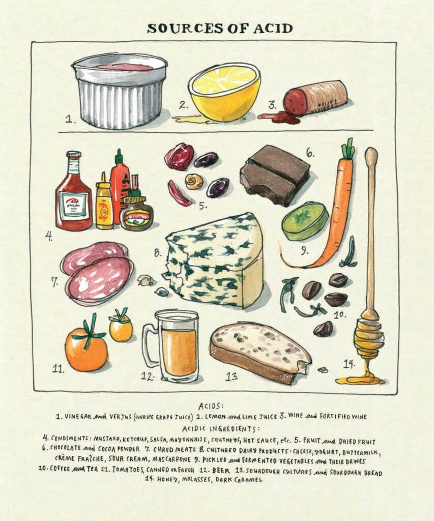
Let's talk about the Sources diagrams. What was the inspiration?
WM: I've always been a huge fan of those old botanical charts. They do them for all different species too. This is clearly riffing off that. There's four: the sources of acid, fat, salt, and umami. I looked at a ton of old vintage botanical charts. This font is my lettering, but I tried to actually find the original engraving, to replicate the 18th-century lettering. The color—the watercolor wash of the page—is meant to mimic the unbleached cotton rag they used back then.
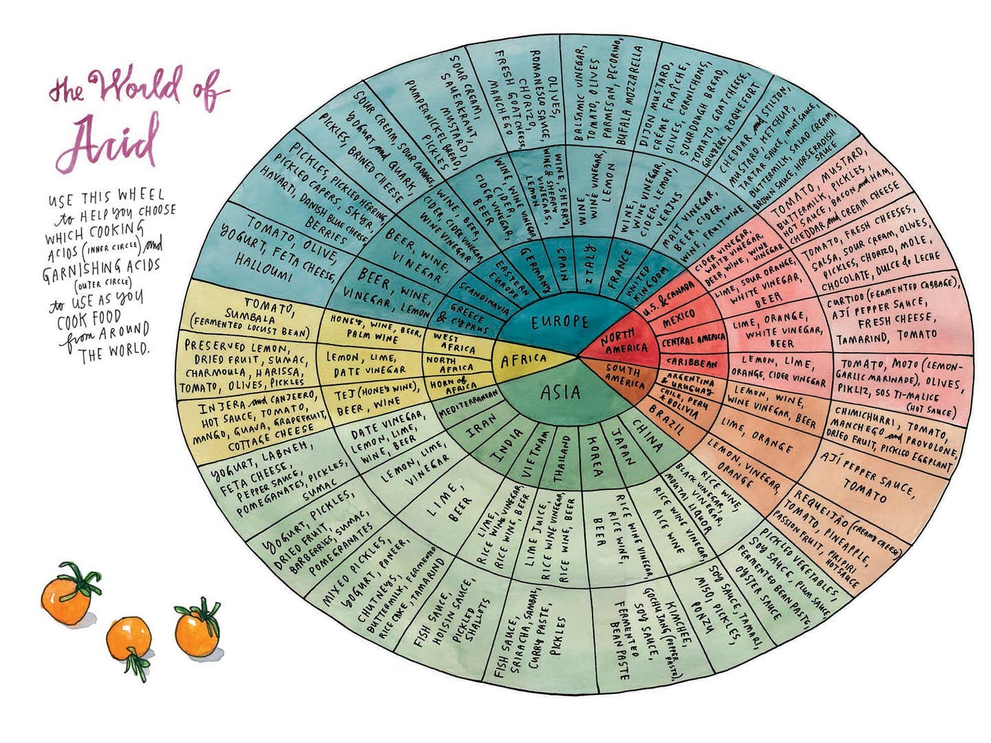
Okay, what about these beautiful wheels? The World of Acid and so on?
WM: The colors were chosen based on master painters. The Flavor Wheel is based on Vermeer. The Acid Wheel is Caravaggio, and the fat one is Clara Peeters. I found paintings that had tableaux—table top, still lives. And they had a lot of fats, acids, and spices in them. I drew colors from that and moved them around a little bit.

During the collaboration, was there anything, Samin, that you didn't realize needed to be illustrated that Wendy helped to clarify?
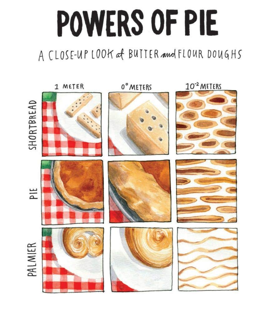
SN: I think a really fun one to talk about is the Powers of Pie. Wendy has a background in social work and I didn't understand what that meant.
WM: People think about social work as being therapy, but it's actually how people and society—how different systems work together and how they influence each other. You use mapping and diagramming to understand the interactions between people. Also, I have a background in art and design. This one is taken more from that area of interest. Do you know the Charles and Ray Eames film, "The Power of Ten?"
SN: It's so incredible.
WM: It's a film where they start with a couple who are lying on a blue check blanket in Chicago. And it zooms out by powers of ten all the way into the universe, and then it comes back and it zooms all the way into their skin. When Samin said that she wanted to go into the structure of the flour, we did it that way. We start on that same blanket, except we made ours red. If you get it, great. You're a design geek. If you don't get it, it doesn't matter. We figured it out.
I love that. Is there anything else like this?
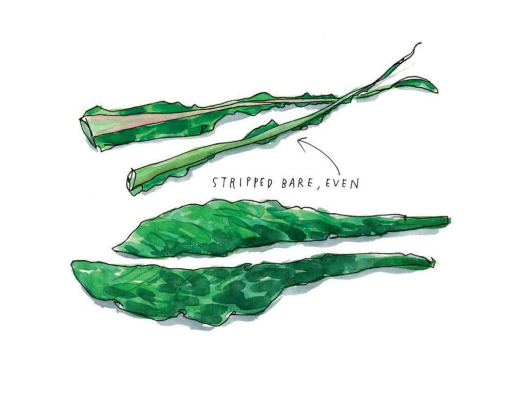
SN: What about the kale?
WM: That's my dorky little art joke to myself. Nobody gets it.
Are you referencing Duchamp?
SN: Girl! You're the first one!
(Psst, reader: Marcel Duchamp created a piece between 1915 and 1923 called The Bride Stripped Bare by Her Bachelors, Even. It’s two panels of glass lined with paint and wire, and it resides in the Philadelphia Museum of Art's permanent collection.)
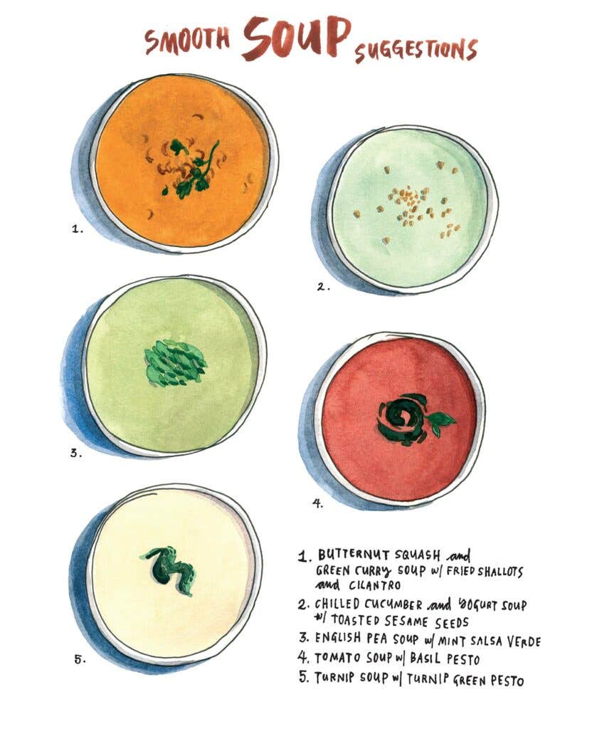
WM: Samin was stripping kale bare, and I had the idea. We snuck our little jokes in. Samin's writing is the same. The soups are a reference to Wayne Thiebaud, his pies, and his little blue shadows.
How long did this whole process take?
SN: Too long.
WM: You've been working on it for 17 years.
SN: I had the idea a long time ago, and then it took me a good three years to write the proposal, and another year to create it with Wendy. We felt it had to be fully illustrated and designed. I knew I was going to try to break so many rules that the only way to convince them was to give them the experience of what reading the book would feel like. I knew we had to illustrate the proposal and I knew we just had to knock 'em dead. It took a lot of time.
WM: Then we sold it in 2013.
Did they get it when they saw it?
SN: Yeah. People went crazy. My agent turned it in and five minutes later, she started getting phone calls.
WM: It went to auction.
SM: It's been so cool. This week other editors and publishers, they've all remembered it. A lot of them are coming out and congratulating us. We're getting emails from other publishers just saying, "You did it, congrats."
Salt Fat Acid Heat is the inaugural selection for our Saveur Cookbook Club. Buy it here, and follow along with us on Facebook, Instagram, and Twitter as we cook our way through.
Keep Reading
Continue to Next Story
