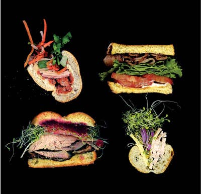
Looks Delicious: Scanwiches
This blog serves up a visual feast
The sandwich has never appeared more sublime than on the blog Scanwiches, in which cross-sectioned sandwiches float in eerie stillness against a velvet black background. The key to the images' saturated colors and shallow depth of field is that they're not photographs but scans. Brooklyn-based Web designer Jon Chonko began the site in February 2009, after one of his cowork-ers blurted out the mispronunciation "scanwich" during a bout of wordplay. The project took on a life of its own, with Chonko tracking down new sandwiches to feature—and refining his sense of what's scan-worthy. "I became interested in confusing combinations of ingredients," he recalls, "because I wanted texture and visual complexity." He now makes most of the sandwiches himself, which allows him to better manipulate their look.
To create an image, he simply places half a sandwich on the glass of his Epson V700 scanner. "There's not a lot of trickery," says Chonko, who will release a book based on the site in November, with Powerhouse Books. "I try to stay true to the heart and soul of the sandwich. That's a lofty way to think about it. But then I eat it for lunch." —Helen Rosner
_
_
_
_
Keep Reading
Continue to Next Story


