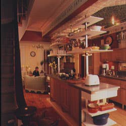
Kitchen at the Center of the Universe
"I don't think my 16-year-old, John, ever set foot in our kitchen before," says Phyllis Johnson, a preschool teacher who shares this Brooklyn, New York, house with her three children and designer Ben Lloyd. "But last night, John walked into this new room and volunteered to cook dinner! Why? This kitchen is the center of our universe. And, just like the rest of us, he likes to be where the action is."
The original kitchen in this 1850s row house was, like many urban kitchens of the 19th century, banished to the basement, where it was built around a huge brick hearth. Although Brooklyn—a prosperous merchant-class suburb—was not yet linked to Manhattan (the Brooklyn Bridge wasn't built until 1883), high style was the order of the day. All the lively goings-on of the house took place two floors up, amid the formal parlor's Anglo-Italianate carved moldings, ornate chandeliers, and Victorian furnishings. The family probably hardly ever set foot in that basement kitchen, which was most likely run by servants.
Eventually, the town house was "modernized," probably in the 1940s, and the kitchen moved upstairs—smack into the front parlor on the ground floor. The adjoining hallway became the pantry—a dark passageway linking kitchen to dining room.
That's the way Johnson and her family lived with the house—which was fine when the children were little, but as they got older, Johnson wanted a space where they could really interact. Their formal dining room, however, was much too formal, and the second-floor parlor was so chock-full of antiques that, says Johnson, "it was a no-kids zone. They passed right by it." Ben Lloyd, who's had his way with several vintage Brooklyn town houses, bringing them resoundingly into the 20th century, saw a way to improve the way the house worked. Knocking down the pantry wall—and opening the kitchen to the heart of the house—not only revived wasted space but transformed the whole floor. "It's not just three rooms anymore, but a hub—a 24-hour place," he explains.
What Lloyd couldn't predict was how the renovation would affect the family dynamic. "I had no idea that a floor plan could make such a difference in the way we live," Johnson says. "Even before the room was finished, we'd sit among the debris and cook at the stepladder. We're drawn to this room now, and to each other. No one wants to leave."
**THE DETAILS
**
Phrasemaking (photo 1): Removing the pantry wall left an arched opening into the kitchen, and it quickly became apparent to Lloyd that the remaining strip of wall was a perfect setting for an appropriate phrase—so the family set out to find it. Molly wanted Dylan's "Shelter from the storm." But they settled on "Rooste, and sethe, and broille, and frye"—a quote from the prologue to Chaucer's Canterbury Tales, which John was reading at the time, and it was painted directly on the wall.
Cabinetmaking (photo 2): No one-size-fits-all solution to the kitchen cabinet dilemma would have satisfied Lloyd's creative impulses. He was drawn to the vast range of possibilities of SieMatic's Modula series. Oak, laminates, glass (both textured and clear), stainless steel—the materials are deliberately varied and the combinations endless. Gutsy handles adorn drawers and doors, some of which open upward. The glass shelves (on brackets) that host a row of espresso pots, and the soap and towel holders below, are all part of the line. Countertops are a muted gray Corian that "reads as zinc, like in an old bar," Lloyd observes. The gas burners on the Gaggenau cooktop are professional scale. A confident slash of red paint picture-frames the clock and radio.
The Lowdown (photo 3): Who says a dishwasher has to be flat on the floor, making us bend and stoop with every load? Here, Lloyd lifts the dishwasher to almost counter height, radically increasing that appliance's convenience factor. The two workstations stand on legs, like furniture, connecting the dining room (now at the front of the house) to the sitting area in the back, where new French doors lead to the garden. Low, open shelves on the cooking island are part of the cabinetry.
The Ceiling (photo 4): "The ceiling is going to be all tile and mosaics—like the Oyster Bar," Ben said. "You're kidding." Phyllis replied. He wasn't. But there was method to this madness: The entire ceiling became a hood for the cooking area, complete with electric fans with metal grates for ventilation. Tumbled marble and bronze glass add unexpected—and un-kitchenlike—glitter. Lighting is surprisingly basic: Four 25-watt candelabra bulbs (on dimmers) illuminate the entire room. No fancy recessed lighting, no fussy fixtures—just lots of light.
Shopkeeping (photo 5): Lloyd began his design career doing interiors for the Habitat shops in London, so it's no accident that the two sets of shelves he designed to tower over the cooktop island resemble display cases (to him, these suggest tiered bakery cake stands). He made the shelves, with their fluted backs, from a flecked white Corian. "I almost feel like we need some kielbasa hanging from them," says Johnson. So the shelves won't block light from the work surface, Lloyd installed small, bare, oblong exit bulbs. A brushed steel bar (from a metal fabricator) is suspended from the ceiling to bring pots and pans within arm's reach.
**Upside-Down **(photo 6): Lloyd has never seen the sense in wasting prime eye-level refrigerator space on the less-used freezer. This Sub-Zero turns tradition on its head, putting the freezer down below. To make a good thing better, it even has drawers. The refrigerator is treated like another cabinet, with SieMatic laminate facing and handles. Using a renewable resource like bamboo for the floors appealed to Lloyd's environmental, as well as aesthetic, inclinations.
**Recycling **(photo 7): The original pantry cabinet—which once formed the galley passage—was worth saving. Carefully removing it when he took down the wall, Lloyd repositioned it in the sitting area (which used to be the dining room) that flanks the kitchen: "We never used the fireplace. It was always too crowded in there." Now the fireplace is back in business. Proving that great eyes see possibilities everywhere, Lloyd and Johnson found these two half-sofas on a trip to the dump—meticulously protected under layers of plastic slipcovers.
Keep Reading
Continue to Next Story


