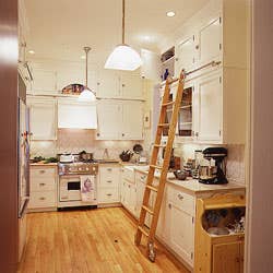
A Perfectly Roomy Kitchen
I've composed BLTs from the backseat of a VW Bug, salade niçoise in the churning belly of a 25-foot sloop. And though I've never quite matched my mother's feat of coq au vin over a campfire at 12,000 feet, I have made dinner for eight from—literally—a closet.
But I'd rather cook in comfort. So when the time came to have at our Formica-clad Chicago kitchen, I had a folder thick with fantasies at the ready. I longed for a more efficient floor plan that returned the fridge (exiled to the adjacent pantry) to the kitchen. Space for all those books. Work surfaces that worked. Death to the dirt-enamored blue vinyl floor. And a handsome style that would mesh with, but not imitate, the 1915 simplicity of our condo. The problem was fitting it all into 160 square feet, and I spent a lot of time sitting on the doomed blue vinyl, trying to figure out where to squeeze what.
With the help of a patient architect, a skilled contractor, a resourceful husband, and an extremely opinionated mother, I managed to work everything in by taking dead space out. That meant eliminating two doors (for counter space all the way around), raising a window (to let the farmhouse sink slip underneath), and transforming the pantry into a vestibule (which rerouted traffic and snowy boot buildup). We put down new oak floorboards, and ran cabinets floor to ceiling to use room overhead. To keep the upper-level storage within everyday reach, we added a library ladder. This is a city kitchen, so windows have to endure grates. To avoid the incarcerated look, I took two sketches to a local ironsmith, who did a perfect job of translating them to large format. Now a steaming cup of coffee peeks in one window, and buttered toast peers into the other.
The kitchen was finished just in time to cool our daughter Hannah's first birthday cake on the new limestone countertops. The project took twice as long as we had expected, cost twice as much as we had feared—and it works at least twice as well as we had dreamed it would. There was even a little wedge of space left over, just enough for Hannah's baby kitchen.
**THE DETAILS
**
A Perfect Fit: The 30" range is a hybrid between home appliance and restaurant equipment—small enough to fit comfortably into the condo kitchen, but equipped with four professional-caliber gas burners. Another good find: Eskin's old dorm-room desktop, which they excavated from the garage and sanded down. Now this 43" x 25" butcher block serves as countertop just to the left of the stove—a built-in chopping station.
Hard Truths: "After considering mountains of granite," says Eskin, "I finally had to admit that I don't really like its high-gloss showiness." Instead, Eskin found a matte-finish, sand-toned slab of limestone. "It looks great with the tile and white wood," Eskin tells us, "and it's even embedded with a few Jurassic-era shrimp." The sink makes the most of space. Set deep into the work space, only its "apron" front is visible—an accent bridging cabinetry and countertop.
Order on Display: Wood or glass? A mix of cabinets breaks up the usual kitchen monotony—and allows Eskin to hide some things ("lightbulbs, phone books") and display others ("ceramics, tons of cookbooks"). A wine-rack-cum-cooler (with Hannah-proof lock) holds bottles at cellar temperature. Stretches of countertop make the island solution unnecessary, clearing the way for a breakfast table and chairs.
Form and Function: Eskin chose handmade tiles in a gentle vine pattern to creep along the backsplashes—which wrap all the way around the room for easy cleanup. Says Eskin, "The tile, like nearly everything else, is white, simple. I doubt it will ever induce avocado-green regrets." A warm yellow color on walls keeps the room from looking too stark. The steaming coffee cup and buttered toast window grates make the most of a first-floor city necessity.
Keep Reading
Continue to Next Story


